NI BLOG
ネイチャーインサイト株式会社の情報発信ブログ
SASに関する技術情報など
How to plot a single regression line -Salesforce Einstein Analytics-
How to plot a single regression line -Salesforce Einstein Analytics-
While we utilize dashboards with Salesforce Einstein Analytics,
sometimes it would be helpful to understand the KPI trend if it contains the regression line.
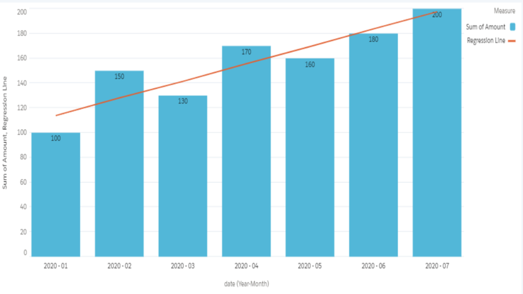
Here is the article how to add a simple linear regression (SLR) to a chart with Salesforce Einstein Analytics.
We would achieve this combo chart at the end of this article.
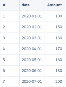
Let me explain with mini example below.
I would set 'Amount' as a target variable (=y) and 'date' as an explanatory variable (=x).
Technically speaking, 'date' is converted to a measure as 'date_day_epoch' (the number of days from 1st Jan 1970).
We can assume that 'Amount' increases as time passes.
Mainly, there are two steps to draw the single regression line. One is to create a table for regression parameters, and another one is to create a chart with editing JSON.
Let's create a combo chart, which contains a regression line, with the following steps.
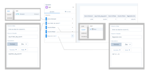
1. Create a table for regression parameters
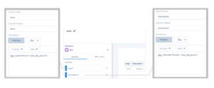
In order to calculate slope and interception, add two measures with formulas in a compare table.
[slope] regr_slope('Amount', 'date_day_epoch')
[interception] regr_intercept('Amount', 'date_day_epoch')
regr_slope is the function to return slope with syntax regr_slope(Y, X).
And regr_intercept is the one to return interception with syntax regr_intercept(Y, X).
For more information about these functions, the official documents should be referred.
https://developer.salesforce.com/docs/atlas.en-us.bi_dev_guide_saql.meta/bi_dev_guide_saql/bi_saql_fn_agg_rs.htm
Now name this query as "table".
2. Save it
Then, we move on to the next step to create a combo chart with editing JSON.
1. Create a combo chart as a base
Add four measures
(A) Sum of 'Amount'
- Should be the bar chart in this combo chart.
(B) Add a field with formula: avg('date_day_epoch')
- Should be used for the calculation of SLR
(C) Count of records
- Should be changed to 'slope' in coming step and used for the calculation of SLR
(D) Count of records
- Should be changed to 'intercept' in coming step and used for the calculation of SLR
(E) Add a field with formula: ('B'*'C')+'D'
And please do not miss to change to Combo chart from a compare table, set 'date_Year~~~date_Month~~~date_Day' as grouping, and choose Single Axis for Axis Mode before ending to edit.
2. Save it
3. Go to Advanced Editor of this combo chart
As you may know, we can edit JSON just of a part of this widget from here.
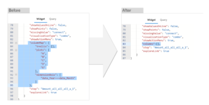
4. Delete "columnMap" section and add "columns" section of Widget
Please note that if "columnMap" section of Widget remains, it should cause an error because dashboard avoids from plotting the measures incorrectly.
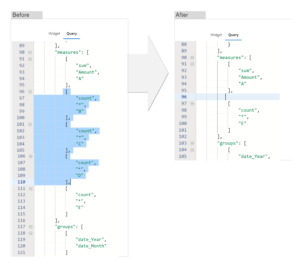
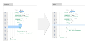
5. Delete three measures, B, C, and D in measures property of Query
This "measures" property works to plot which measures are shown on the widget. As editing via UI, it would be Hide/Unhide.
In case of this example, we just need to show sum of 'Amount' and the result of SLR (B*C+D), so B (average of date_day_epoch), C (the value of slope) and D (the value of interception) should be hided.
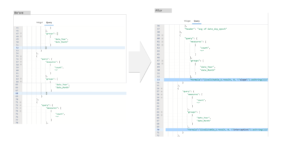
6. Add "formula" in "columns" property with "{{cell(table.result, 0, \"slope\").asString()}}" and "{{cell(table.result, 0, \"interception\").asString()}}" for C and D respectively.
We could refer the values of slope and interception from table by interaction.
For understanding more about interaction, the official reference should be helpful.
https://developer.salesforce.com/docs/atlas.en-us.bi_dev_guide_bindings.meta/bi_dev_guide_bindings/bi_dbjson_bindings.htm
7. Delete B, C and D in "columnMap" property of Query
"columnMap" section contains which and how to show the measures and dimensions on dashboard, so these three measures should be hided as the same reason with step5.
8. Save it
Completed!
If you have any inquiries, please feel free to comment.
Thank you so much to read till the end.








コメント